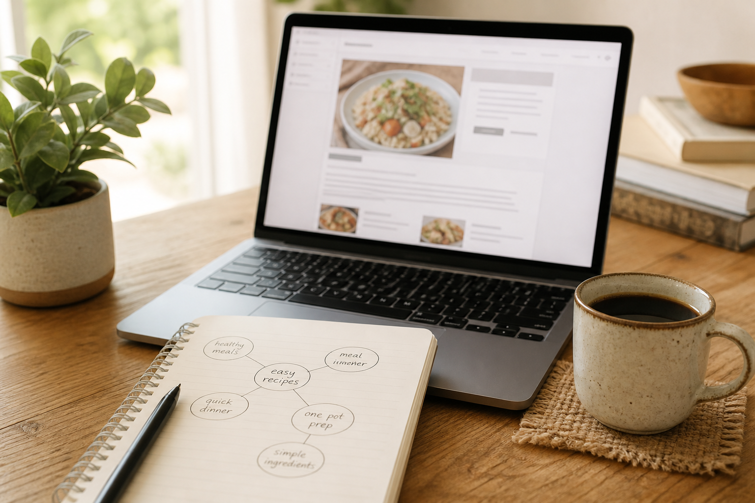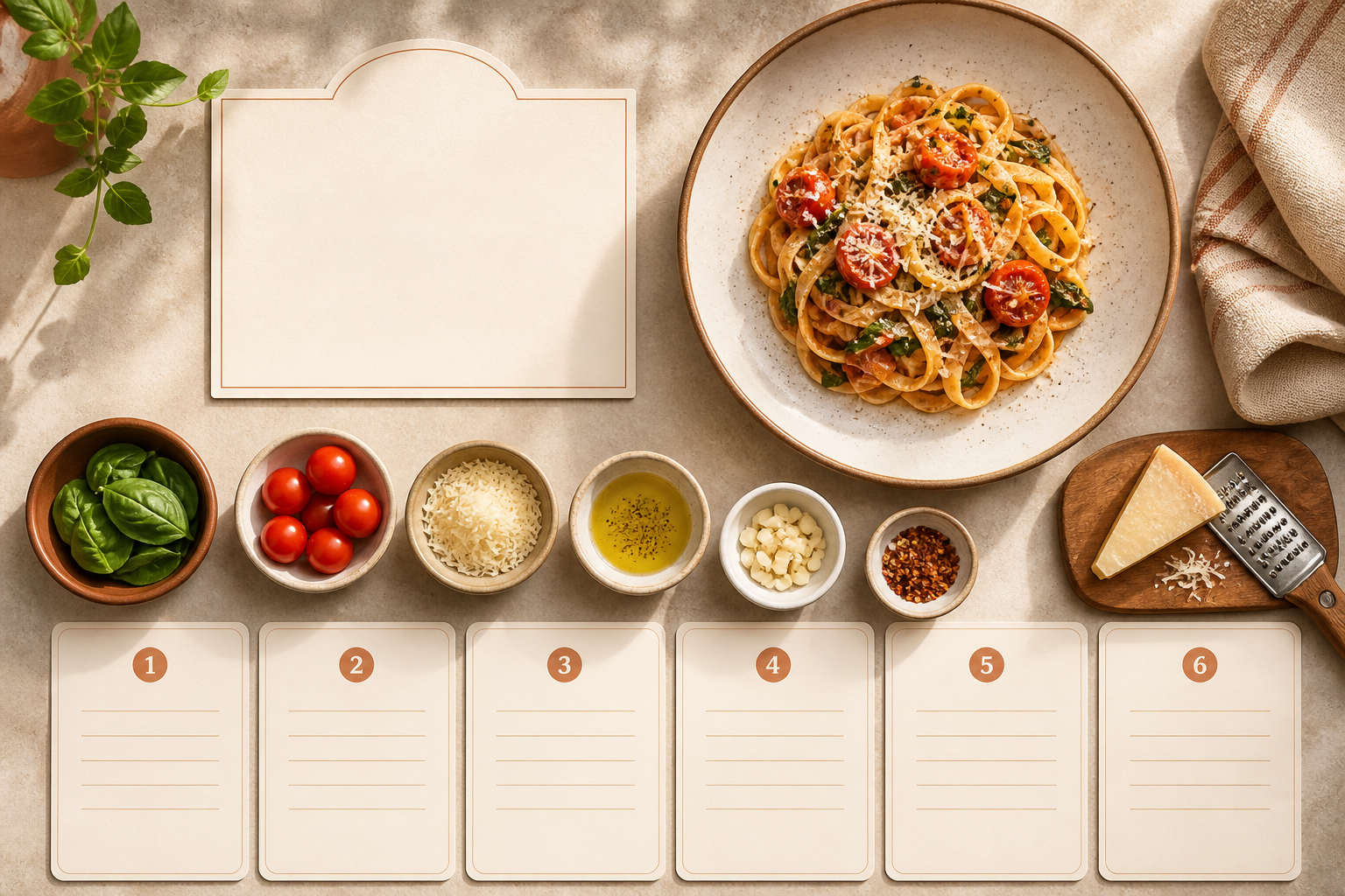
The best recipe page layout is the one a tired cook can use with flour on their fingers. Fancy is optional. Scannable is not. You do not need a theme marketplace tour to get there — you need a clear order of information.
Layout assumes you already have a blog to put recipes on. New here? Start with how to start a food blog.
A layout order that works
- Recipe title
- Short intro (why this dish, when you make it)
- Featured photo
- Key facts — time, servings, yield
- Ingredients
- Numbered steps
- Notes, substitutions, storage
- Optional related recipes
Put the cookable parts close together. If someone has to jump over a novel to find the salt, they will leave — and that long preamble is not helping SEO either.
Design for the phone first
Most people cook with a phone propped against the flour jar. Large type, clear step spacing, ingredients that do not require pinch-zooming, and buttons that do not cover the method. If it only looks good on a desktop monitor, it is not done.
Make printing painless
A print-friendly view — or a page that prints cleanly — still matters. Jump links to the recipe help. Huge ads and decorative sidebars do not.
Give the photo a clear job
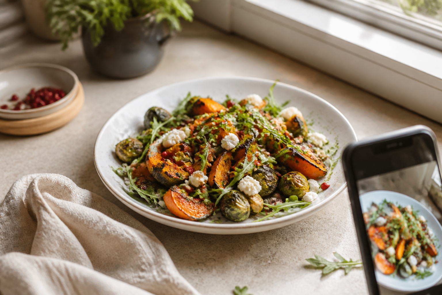
One strong finished-dish image near the top sets expectations. Step images belong next to the steps they explain, not in a detached gallery that breaks the flow. More on shooting them in how to take food photos for your blog.
Layout mistakes to avoid
- Ingredients and steps separated by walls of fluff
- Tiny grey text on busy backgrounds
- Auto-play videos that shove the method down
- Pop-ups that cover the first step
- Decorative cards that make scanning harder, not easier
See a live example
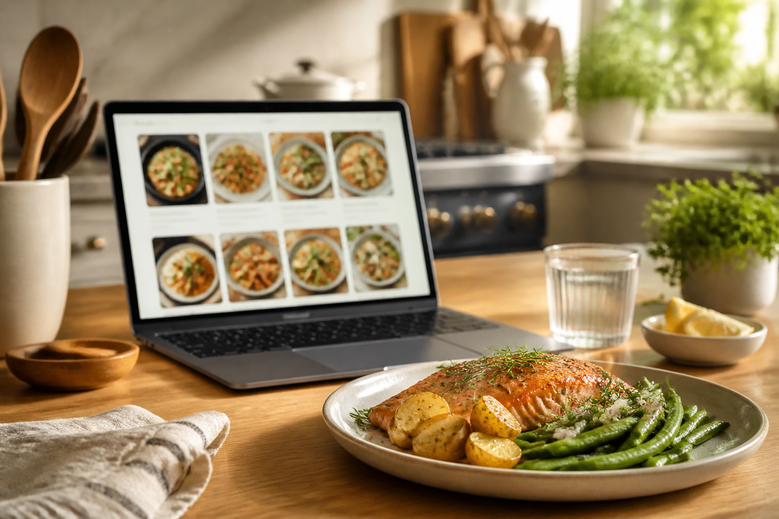
Want a concrete reference? Browse an Savorible Kitchen and notice how the recipe pages keep title, photo, ingredients and steps in a straight line for the cook. For how that structure ties to search, see food blog SEO: what actually matters.
Start your food blog
Start your very own food blog in 10 minutes.